

Aug 6, 2021
1 min read
Updated: Aug 2
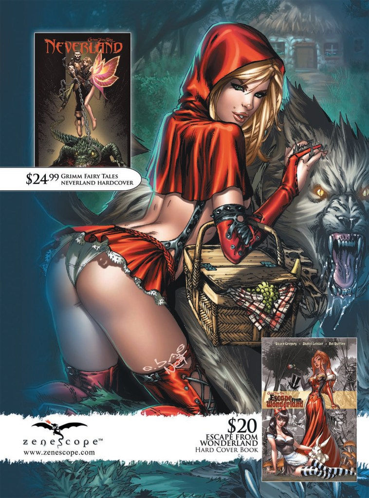
Two things worth noting here. First, the font on that cover in the upper left corner is terrible. I thought it said “Neverbland,” which is clearly wrong. Make sure your R doesn’t look like a B. Second, I get why Little Red Riding Hood has tiny white panties, but I really wish I didn’t.
(Heavy Metal Living Dead Special, Spring 2011 – Page Inside Front Cover Zenescope ad)


Comments